In a previous post, I described how you could reduce your carbon footprint at zero personal financial cost by simply choosing to run high-energy consuming appliances - such as washing machines, dishwashers, and tumble dryers - but only when the carbon intensity of the electricity grid was low.
As can be seen in Figure 1, the carbon intensity (gCO₂/kWh of electricity) of the grid has decreased significantly (~74%) over the past 10 years or more. In both 2021 and 2022, carbon intensity was, on average, around 180 gCO₂/kWh. However, there were times when that value dropped below 100 gCO₂/kWh, most often when the winds were blowing and over half of our electricity came from wind turbines.
I use Gridwatch and National Grid: Live to tell me the composition of the UK electricity generation mix in terms of low-carbon (wind, solar, nuclear, hydro) and high-carbon (gas and coal) sources. If the low-carbon sources are providing at least 70% of the UK grid electricity, then I put on a laundry wash or start the dishwasher (assuming both are full, of course).
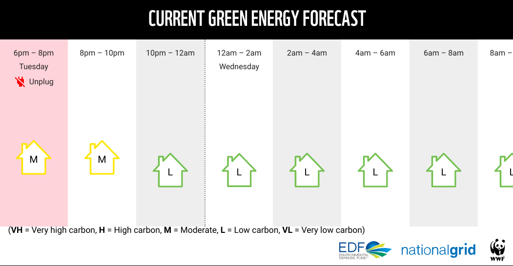
Fortunately, someone far cleverer than me has greatly simplified this process by producing an easy-to-read 24-hour green energy forecast (Figure 2) ...
... and, even a 2-day forecast (Figure 3) if you need to plan further ahead ...
There is a remarkably good agreement between the '
forecast' and '
actual' carbon intensities as shown in Figure 3. With an average grid intensity of 180 gCO₂/kWh of electricity (2021 & 2022), you can halve your carbon emissions from intermittent high-energy-use appliances by only using them when the forecast is either low carbon (L) or very low carbon (VL).
Since the production of low-carbon electricity varies with the different regions of the UK (e.g. Scotland has a lot of wind turbines and tends to be L or VL), Carbon Intensity also provides information on how 'green' your region's electricity is (Figure 4). This gives you more flexibility in choosing when to 'put on a wash' depending on where you live.
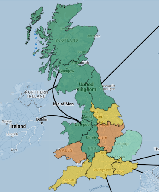 |
| Figure 4: Regional Variations in how 'Green' is your Electricity |
This information is also provided in a handy table:
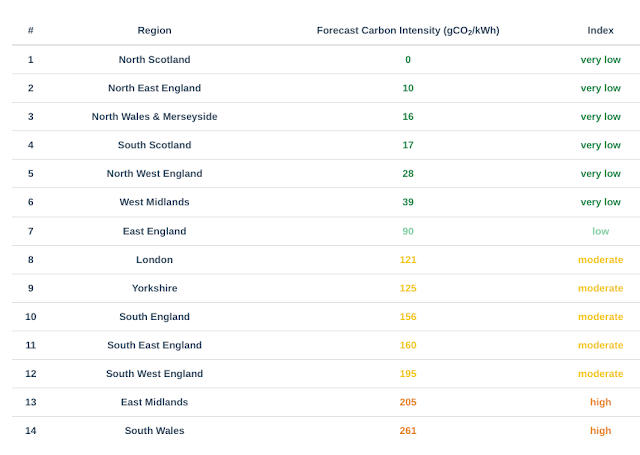 |
| Figure 5: Snapshot of Regional Carbon Intensities (gCO₂/kWh) |
A new feature of the regional UK map at
Carbon Intensity is to show the direction of 'power flows' (Figure 6) from one region to another.
Scotland, for example, produces an excess of low-carbon electricity especially when the wind blows; hence the power flows south toward England most of the time.
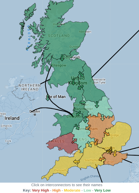 |
| Figure 6: Power Flows from Region to Region |
The
Pembroke B gas-fired power station (South-West Wales) is the largest in Europe and may explain why this region has a tendency to be high- or very high-carbon intensity. In contrast, North Wales has a fair bit of wind power (onshore and offshore) and pumped storage hydropower (
Dinorwig) which combined with a small, mainly rural, population means it can export this low-carbon electricity to other regions. The North-West and North-East both have nuclear power.
When the wind drops (Figure 7), much of the southern part of the UK has a moderate to very-high carbon intensity. Herefordshire has has moved up to 'moderate' carbon intensity - so there will be no laundry or dishwashing for the time being in this household!
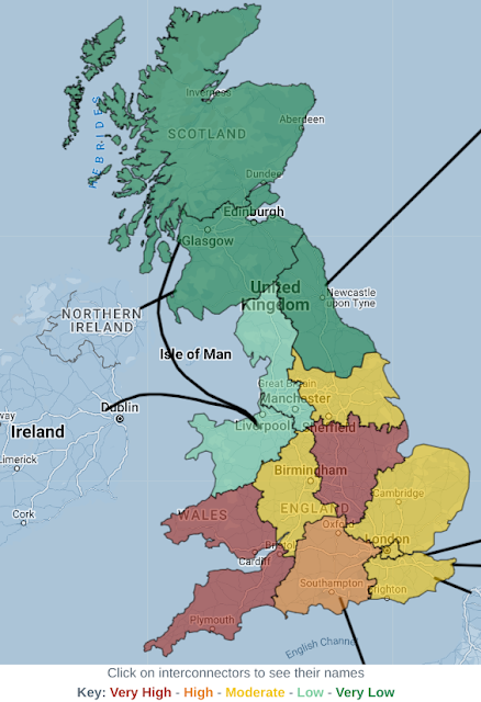 |
| Figure 7: Regional Carbon Intensities (3/2/23) |


0 comments:
Post a Comment